Hello Everyone,
The major stock indexes fell about 5% in May and rebounded most of the loss in June so far in one week. Source: CNBC.com
CURRENT EVENTS INFLUENCING MARKET MOVEMENT:
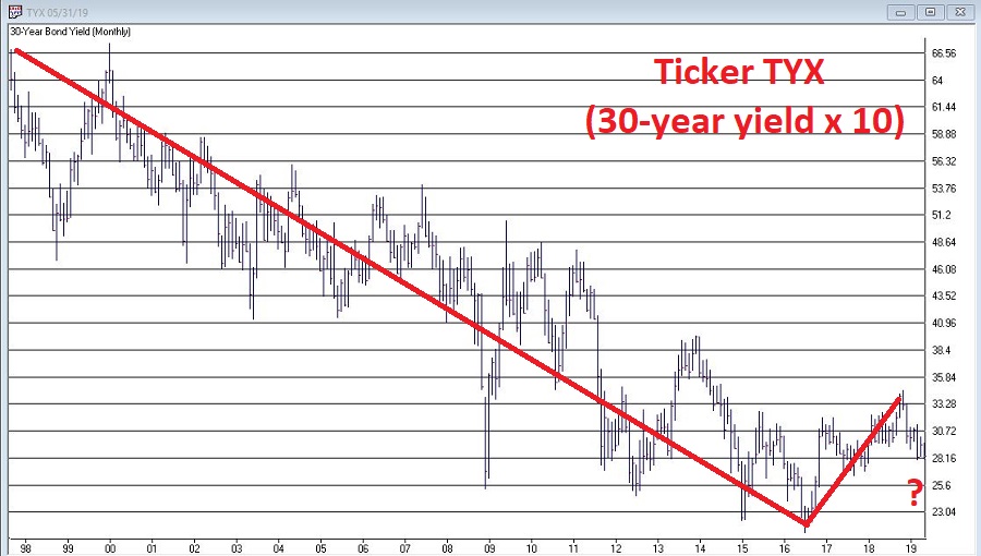
Stocks fell because of the Chinese and the 5% Mexican tariff announcement. There will probably be a positive announcement on the Mexican tariff front as tariffs will hurt our economy and the auto industry. In a positive development, Fed officials said they would be open to reducing interest rates if the tariffs weaken the economy. The current interest rate on the ten-year bond has dropped from 3.2% on the ten-year bond to about 2.10% now just in roughly six months. The affordability of buying a new house has gotten much better.
Trump will do what he can to shore up the economy, and if the markets fall, he is keenly aware of stemming any significant decline in the stock market as he wants to be reelected. The jobs report was a little weaker than was expected; that is why the Fed may reduce interest rates to keep the economy on an upward trajectory consistent with a 2-3% per year growth in the GDP. Overall, I am still positive on the economy unless full tariffs are enacted on the Mexican and the Chinese economies.
If they are expanded to the 25% fully enacted, I will be getting more cautious on the economy and the stock markets.
INTEREST RATE SCENARIO
The Federal funds rate is about 50 basis points or half of 1% higher than the two and five year Treasury Notes and has historically indicated that a recession is looming. The next few months will indicate whether the economy will soften. At this point, I don’t think it will decline as much as to go into recession, but there are still risks. Trump will determine what will happen to the economy. If the tariff situation is resolved, then I think the economy will still be in a growth phase, but if the tariffs are not resolved and get worse, the risks of a recession will increase dramatically.
MARKET RECAP:
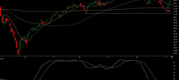
Last month on my May 5th Bartometer I said that if the S&P 500 closes below 2,886 I will get VERY CAUTIOUS and It did. After that, it proceeded to 2,740 a drop OF 5%, AND my computer models gave a BUY signal ON 6/5/19, the big up day at 2,800, and it rallied to an intraday high of 2,885.85 and closed at 2875. Even though we are on the BUY-HOLD signal, I would like the S&P 500 to break out of 2886, preferably the 2,893 level and stay there for 2 to 3 days for me to believe the rally can approach the old highs of 2,954. See the charts for an explanation.
Index Averages
Some of the INDEXES of the markets both equities and interest rates are below. The source is Morningstar.com up until June 7, 2019.
*Dow Jones +12.50%
S&P 500 +15.60%
NASDAQ Aggressive growth +17.50%
I Shares Russell 2000 ETF (IWM) Small cap +12.97%
International Index (MSCI – EAFE ex USA) +9.97%
Moderate Mutual Fund +8.20%
Investment Grade Bonds (AAA) +7.03% +2.64%
High Yield Merrill Lynch High Yield Index +7.39% +4.26%
Floating Rate Bond Index +4.90% +2.60%
Fixed Bond Yields (10 year) +2.10% Yield 2.63%
The average Moderate Fund is up 8.2% this year fully invested as a 60% in stocks and 40% in bonds.
If interest rates are peaking and look to be flattening or declining over the next year then investment grade or multisector bonds technically might be better than floating rate bonds. But diversification is important.
The S&P 500
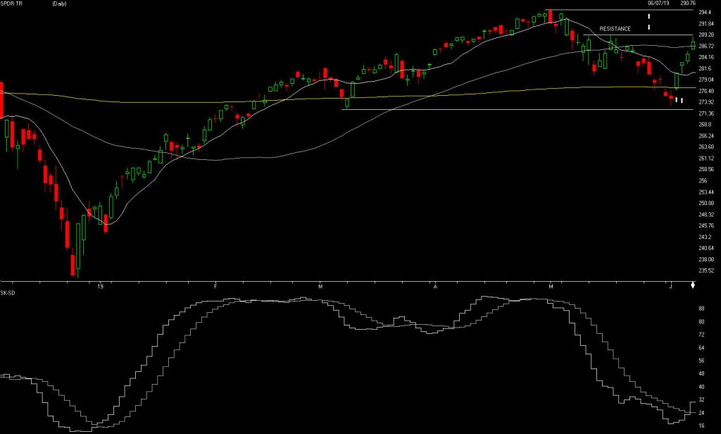
Source: AIQ Systems
The S&P is above. Last month AIQ gave a SELL signal on April 18th but I went to a VERY CAUTIOUS the close below 2,886. The S&P dropped 5% after it closed below 2,886.
My models went to a BUY signal at 2,800 on 6/05/2019 the S&P now we are right back up to 2,875. Where do we go from here? If the 2,893 level can be broken on the Upside which I think it can and stay there for 2-3 days , then the S&P should approach its old high of 2,954 it hit on May 1, 2019. Notice the graph below the S&P. This chart is the SK-SD stochastics, it is breaking out on the upside and it shows the market is oversold and could continue to rally.
Source: Investopedia
*A Support or support level is the level at which buyers tend to purchase or into a stock or index. It refers to the stock share price that a company or index should hold and start to rise. When a price of the stock falls towards its support level, the support level holds and is confirmed, or the stock continues to decline, and the support level must change.
- Support levels on the S&P 500 area are 2865, 2811, 2740, and 2683 areas. These might be BUY areas.
- Support levels on the NASDAQ are 7704, 7414, 7291, and 7171.
- On the Dow Jones support is at 25,943, 25739, 25,538 and 25,376. These may be safer areas to get into the equity markets on support levels slowly.
- RESISTANCE LEVEL ON THE S&P 500 IS 2885. If there is a favorable tariff settlement, the market should rise short term.
THE BOTTOM LINE:
The S&P 500 is right at the point where it needs to break out of 2,893. I am still Moderately Bullish on the market and think it will break out. My computer technical models are on a short term buy signal, so do I think the S&P will breakout above 2,954, the old high it hit on May 1, 2019? We will see, but if it approaches that level, it will be imperative to watch the 2,954 level to see if it turns down. I will be watching that level to see if it is a breakout. If it cannot, then I would become Cautious again.
Best to all of you,
Joe Bartosiewicz, CFP®
Investment Advisor Representative
5 Colby Way
Avon, CT 06001
860-940-7020 or 860-404-0408
Contact information:
SECURITIES AND ADVISORY SERVICES OFFERED THROUGH SAGE POINT FINANCIAL INC., MEMBER FINRA/SIPC, AND SEC-REGISTERED INVESTMENT ADVISOR.
Charts provided by AIQ Systems:
Technical Analysis is based on a study of historical price movements and past trend patterns. There is no assurance that these market changes or trends can or will be duplicated shortly. It logically follows that historical precedent does not guarantee future results. Conclusions expressed in the Technical Analysis section are personal opinions: and may not be construed as recommendations to buy or sell anything.
Disclaimer: The views expressed are not necessarily the view of Sage Point Financial, Inc. and should not be interpreted directly or indirectly as an offer to buy or sell any securities mentioned herein. Securities and Advisory services offered through Sage Point Financial Inc., Member FINRA/SIPC, and SEC-registered investment advisor.
Past performance cannot guarantee future results. Investing involves risk, including the potential loss of principal. No investment strategy can guarantee a profit or protect against loss in periods of declining values. Please note that individual situations can vary. Therefore, the information presented in this letter should only be relied upon when coordinated with individual professional advice. *There is no guarantee that a diversified portfolio will outperform a non-diversified portfolio in any given market environment. No investment strategy, such as asset allocation, can guarantee a profit or protect against loss in periods of declining values.
It is our goal to help investors by identifying changing market conditions. However, investors should be aware that no investment advisor can accurately predict all of the changes that may occur in the market.
The price of commodities is subject to substantial price fluctuations of short periods and may be affected by unpredictable international monetary and political policies. The market for commodities is widely unregulated, and concentrated investing may lead to Sector investing may involve a greater degree of risk than investments with broader diversification.
Indexes cannot be invested indirectly, are unmanaged, and do not incur management fees, costs, and expenses.
Dow Jones Industrial Average: A weighted price average of 30 significant stocks traded on the New York Stock Exchange and the NASDAQ.
S&P 500: The S&P 500 is an unmanaged indexed comprised of 500 widely held securities considered to be representative of the stock market in general.
NASDAQ: the NASDAQ Composite Index is an unmanaged, market-weighted index of all over the counter common stocks traded on the National Association of Securities Dealers Automated Quotation System
(IWM) I Shares Russell 2000 ETF: Which tracks the Russell 2000 index: which measures the performance of the small capitalization sector of the U.S. equity market.
A Moderate Mutual Fund risk mutual has approximately 50-70% of its portfolio in different equities, from growth, income stocks, international and emerging markets stocks to 30-50% of its portfolio indifferent categories of bonds and cash. It seeks capital appreciation with a low to moderate level of current income.
The Merrill Lynch High Yield Master Index: A broad-based measure of the performance of non-investment grade US Bonds
MSCI EAFE: the MSCI EAFE Index (Morgan Stanley Capital International Europe, Australia, and Far East Index) is a widely recognized benchmark of non-US markets. It is an unmanaged index composed of a sample of companies’ representative of the market structure of 20 European and Pacific Basin countries and includes reinvestment of all dividends.
Investment grade bond index: The S&P 500 Investment-grade corporate bond index, a sub-index of the S&P 500 Bond Index, seeks to measure the performance of the US corporate debt issued by constituents in the S&P 500 with an investment grade rating. The S&P 500 Bond index is designed to be a corporate-bond counterpart to the S&P 500, which is widely regarded as the best single gauge of large cap US equities.
Floating Rate Bond Index is a rule-based, market-value weighted index engineered to measure the performance and characteristics of floating rate coupon U.S. Treasuries which have a maturity greater than 12 months.