Category Archives: chart patterns

Good for Japan, Bad for US (Bonds)?

In the late 1980’s, Japan seemed destined to “rule the financial world”.  But when it comes to the financial markets – things don’t always pan out as they appear destined to.  The Nikkei Index topped out in late 1989, didn’t bottom out until February 2009 and has yet to return to its 1989 peak.

But it sure is trying.  This past week the Nikkei reached its highest level 1991.  So, hooray for the Japanese.  Back here in the US of A there may be a slightly different take.  For as we will discuss in a moment, what is good for Japanese stocks is (apparently) bad for US bonds.

Ticker EWJ

As our proxy for Japanese stocks we will use ticker EWJ (iShares Japan).  In Figure 1 you can the monthly action since the ETF started trading in 1996. 

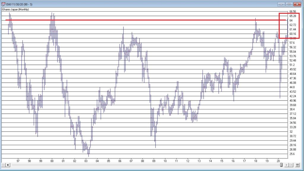
Figure 1- Ticker EWJ monthly (Courtesy AIQ TradingExpert)

Since 1996 EWJ has broken in the $60 a share range on 5 previous occasions, only to be rebuffed.  You can see the latest upward thrust at the far right.  Will this be the time it breaks through?  It beats me and in fact that is not really the focus of this article.  The real question posed here is “what about U.S. treasury bonds?”  Huh?  Consider Figure 2. 

The top clip of Figure 2 displays a weekly chart of EWJ with a 5-week and 30-week moving average drawn.  The bottom clip displays a weekly chart of ticker TLT – the iShares ETF that tracks the long-term U.S. treasury bond. 

Note that – using highly technical terms – when one “zigs”, the other “zags.”

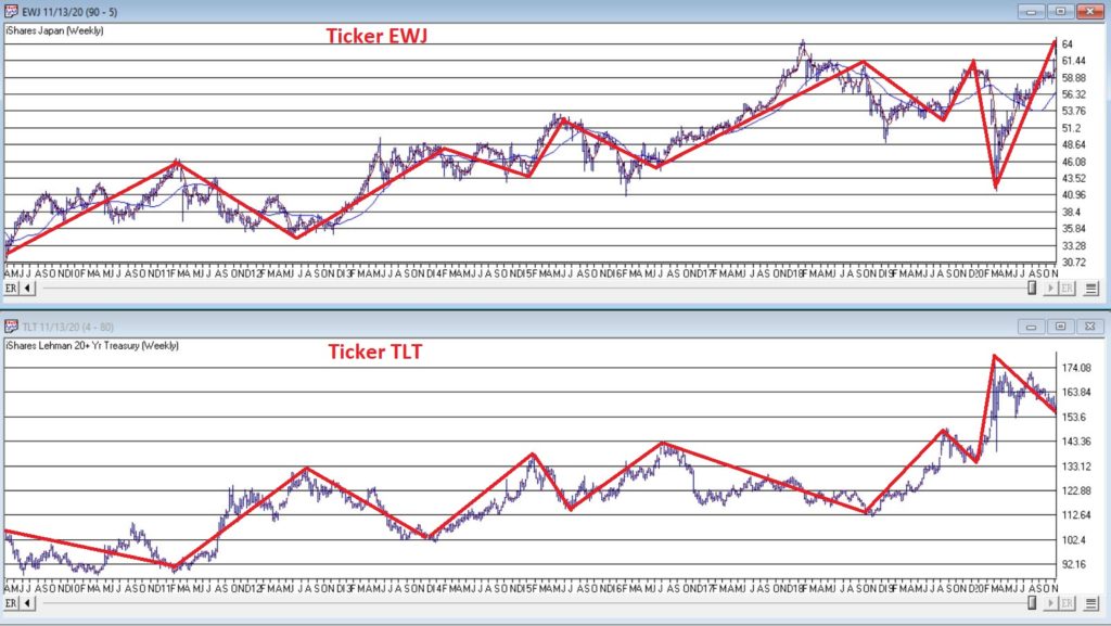
Figure 2 – EWJ vs. TLT (Courtesy AIQ TradingExpert)

The thing to note is the inverse correlation between the two – i.e., when Japanese stocks advance, US treasuries tend to decline and vice versa.  For the record (and for you fellow numbers geeks out there) the correlation coefficient in the last 2 years is -0.45 (1 means they trade exactly the same, -1 means they trade exactly inversely).

For my purposes:

*EWJ 5-week MA < EWJ 3-week MA = BULLISH for US treasuries

*EWJ 5-week MA > EWJ 3-week MA = BEARISH for US treasuries

Any real merit to this? 

*The blue line in Figure 3 displays the cumulative $ +(-) achieved by holding a long position in t-bond futures ($1,000 a point) when the EWJ indicator is BULLISH (for U.S. bonds)

*The orange line in Figure 3 displays the cumulative $ +(-) achieved by holding a long position in t-bond futures ($1,000 a point) when the EWJ indicator is BEARISH (for U.S. bonds)

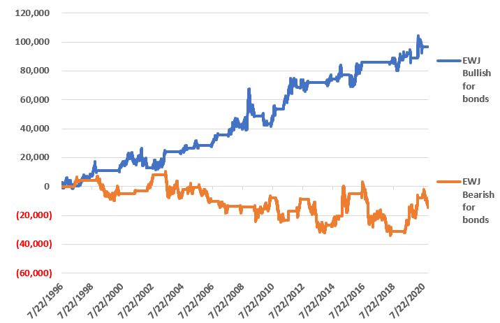
Figure 3 – $ + (-) for Treasury Bond Futures when EWJ indicator is BULLISH for bonds (blue) or BEARISH for bonds (orange)

Summary

Bond investors might keep a close eye on Japanese stocks for a while.  If the latest thrust higher follows through and becomes the move that finally breaks out to the upside, the implication would appear to be negative for U.S. long-term treasury bonds.  On the flip side, if Japanese stocks fail once again to break through and reverse to the downside, then things might look a whole lot better for the 30-year US treasury.

Jay Kaeppel

Disclaimer: The information, opinions and ideas expressed herein are for informational and educational purposes only and are based on research conducted and presented solely by the author.  The information presented represents the views of the author only and does not constitute a complete description of any investment service.  In addition, nothing presented herein should be construed as investment advice, as an advertisement or offering of investment advisory services, or as an offer to sell or a solicitation to buy any security.  The data presented herein were obtained from various third-party sources.  While the data is believed to be reliable, no representation is made as to, and no responsibility, warranty or liability is accepted for the accuracy or completeness of such information.  International investments are subject to additional risks such as currency fluctuations, political instability and the potential for illiquid markets.  Past performance is no guarantee of future results.  There is risk of loss in all trading.  Back tested performance does not represent actual performance and should not be interpreted as an indication of such performance.  Also, back tested performance results have certain inherent limitations and differs from actual performance because it is achieved with the benefit of hindsight.

Please Take a Moment to Locate the Nearest Exit (Part II)

To put this piece in context please refer to Part I here.

Part I detailed the Good News (the stock market is still very much in a bullish trend and may very well continue to be for some time) and touched on one piece of Bad News (the market is overvalued on a long-term valuation basis).

The Next Piece of Bad News: The “Early Lull”

In my book, Seasonal Stock Market Trends, I wrote about something called the Decennial Pattern, that highlights the action of the stock market in a “typical” decade. 

The Four Parts of the “Typical Decade” are:

The Early Lull: Market often struggles in first 2.5 years of a decade

The Mid-Decade Rally: Market typically rallies in the middle of a decade – particularly between Oct 1 Year “4” and Mar 31 Year “6”

The 7-8 Decline: Market often experiences a sharp decline somewhere in the Year “7” to Year “8” period

The Late Rally: Market often rallies strongly into the end of the decade.

Figure 1 – 1980-1989 (Courtesy AIQ TradingExpert)

Figure 2 – 1990-1999 (Courtesy AIQ TradingExpert)

Figure 3 – 2000-2009 (Courtesy AIQ TradingExpert)

Figure 4 – 2010-2019 (Courtesy AIQ TradingExpert)

We are now in the “Early Lull” period.  This in no way “guarantees” trouble in the stock market in the next two years.  But it does offer a strong “suggestion”, particularly when we focus only on decades since 1900 that started with an Election Year (which is where we are now) – 1900, 1920, 1940, 1960, 1980, 2000.

(See this article for a more detailed discussion)

As you can see in Figures 5 and 6, each of these 6 2.5-year decade opening periods witnessed a market decline – -14% on average and -63% cumulative.  Once again, no guarantee that 2020 into mid 2022 will show weakness, but….. the warning sign is there

Figure 5 – Dow price performance first 2.5 years of decades that open with a Presidential Election Year (1900-present)

Figure 6 – Cumulative Dow price performance first 2.5 years of decades that open with a Presidential Election Year (1900-present)

Summary

Repeating now: the trend of the stock market is presently “Up”. 

Therefore:

*The most prudent thing to do today is to avoid all of the “news generated” worry and angst and enjoy the trend. 

*The second most prudent thing to do is to acknowledge that this up trend will NOT last forever, and to prepare – at least mentally – for what you will do when that eventuality transpires, i.e., take a moment to locate the nearest exit.

Stay tuned for Part III

Jay Kaeppel

Disclaimer: The information, opinions and ideas expressed herein are for informational and educational purposes only and are based on research conducted and presented solely by the author.  The information presented does not represent the views of the author only and does not constitute a complete description of any investment service.  In addition, nothing presented herein should be construed as investment advice, as an advertisement or offering of investment advisory services, or as an offer to sell or a solicitation to buy any security.  The data presented herein were obtained from various third-party sources.  While the data is believed to be reliable, no representation is made as to, and no responsibility, warranty or liability is accepted for the accuracy or completeness of such information.  International investments are subject to additional risks such as currency fluctuations, political instability and the potential for illiquid markets.  Past performance is no guarantee of future results.  There is risk of loss in all trading.  Back tested performance does not represent actual performance and should not be interpreted as an indication of such performance.  Also, back tested performance results have certain inherent limitations and differs from actual performance because it is achieved with the benefit of hindsight.

Keep a Close Eye on the U.S. Dollar

As the primary currency recognized around the globe, the U.S. Dollar is pretty important.  And the trend of the dollar is pretty important also.  While a strong dollar is good in terms of attracting capital to U.S. shores, it makes it more difficult for U.S. firms that export goods.  One might argue that a “steady” dollar is generally preferable to a very strong or very weak dollar.

Speaking of the trend of the dollar, a lot of things move inversely to the dollar.  In fact, one can typically argue that as long as the dollar is strong, certain “assets” will struggle to make major advances.  These include – commodities in general, metals specifically, foreign currencies (obviously) and international bonds (strongly). 

Let’s first take a look at the state of the dollar.

Ticker UUP

For our purposes we will use the ETF ticker UUP ( Invesco DB US Dollar Index Bullish Fund) to track the U.S. Dollar.  Figure 1 displays a monthly chart and suggests that UUP just ran into – and reversed at least for now – in a significant zone of resistance.

Figure 1 – UUP Monthly (Courtesy ProfitSource by HUBB)

Figure 2 displays a weekly chart which suggests the possibility that UUP has completed a 5-wave advance.

Figure 2 – UUP Weekly (Courtesy ProfitSource by HUBB)

Figure 3 displays a daily chart and paints a more potentially bullish picture, looking for a 5th Wave up.

Figure 3 – UUP Daily (Courtesy ProfitSource by HUBB)

Which way will things go?  It beats me.  But I for one will be keeping a close eye on UUP versus the resistance levels highlighted in Figures 1 and 2.  So will traders of numerous other securities.

Inverse to the Buck

Figure 4 displays the 4-year weekly correlation for 5 ETFs to ticker UUP (a correlation of 1000 means they trade exactly the same a UUP and a correlation of -1000 means they trade exactly inversely to UUP).

Figure 4 – 4-Year Correlation to ticker UUP (Courtesy AIQ TradingExpert)

In the following charts, note the inverse relationship between the dollar (UUP on the bottom) and the security in the top chart. When the dollar goes way down they tend to go way up – and vice versa.

Note also that in the last year several of these securities went up at the same time the dollar did. This is a historical anomaly and should not be expected to continue indefinitely.

Figure 5 – Ticker DBC (Invesco DB Commodity Index Tracking Fund) vs. UUP (Courtesy  AIQ TradingExpert )

Figure 6 – Ticker SLV (iShares Silver Trust) vs. UUP (Courtesy  AIQ TradingExpert )

Figure 7 – Ticker GLD (SPDR Gold Shares) vs. UUP (Courtesy 
AIQ TradingExpert )

Figure 8 – Ticker BWX (SPDR Bloomberg Barclays International Treasury Bond) vs. UUP (Courtesy  AIQ TradingExpert )

Figure 9 – Ticker IBND (SPDR Bloomberg Barclays International Corporate Bond) vs. UUP (Courtesy  AIQ TradingExpert )

Figure 10 – Ticker FXE (Invesco CurrencyShares Euro Currency Trust) vs UUP (Courtesy  AIQ TradingExpert )

Summary

If the dollar fails to break out of it’s recent resistance area and actually begins to decline then commodities, currencies, metals and international stocks and bonds will gain a favorable headwind. How it all actually plays out, however, remains to be seen.

So keep an eye on the buck. Alot is riding on it – whichever way it goes.

Jay Kaeppel

Disclaimer:  The data presented herein were obtained from various third-party sources.  While I believe the data to be reliable, no representation is made as to, and no responsibility, warranty or liability is accepted for the accuracy or completeness of such information.  The information, opinions and ideas expressed herein are for informational and educational purposes only and do not constitute and should not be construed as investment advice, an advertisement or offering of investment advisory services, or an offer to sell or a solicitation to buy any security.

The Big Canary in the Coal Mine…

Technology is what it’s all about these days.  Technology (primarily) runs on semiconductors.  If the semiconductor business is good, business is good.  OK, that’s about as large a degree of oversimplification as I can manage.  But while it may be overstated, there is definitely a certain amount of truth to it.

So, it can pay to keep an eye on the semiconductor sector.  The simplest way to do that is to follow ticker SMH.  Keeping with the mode of oversimplifying things, in a nutshell, if SMH is not acting terribly that’s typically a good thing.  So where do all things SMH stand now?  Let’s take a look.

Ticker SMH

As with all things market-related (among other things), beauty is in the eye of the beholder.  A quick glance at Figure 1 argues that SMH is inarguably in a strong uptrend, well above its 200-day moving average

Figure 1 – SMH in an uptrend (Courtesy AIQ TradingExpert)

A glance at Figure 2 suggests that SMH has just completed 5 waves up and may be due for a decline.

Figure 2 – SMH with potentially bearish Elliott Wave count (Courtesy ProfitSource by HUBB)

And Figure 3 highlights a very obvious bearish divergence between SMH weekly price action and the 3-period RSI indicator – i.e., SMH keeps moving incrementally higher while RSI3 reaches slightly lower highs each time.  Speaking anecdotally, this setup seems to presage at least a short-term decline maybe 70% of the time.  Of course, the degree of decline varies also.

Figure 3 – SMH with 3-period RSI bearish divergence (Courtesy AIQ TradingExpert)

So, what does it all mean?  First off, I am not going to make any predictions (if you knew my record on “predictions” you would thing that that is a good thing).  I am simply going to point out that one way or the other SMH may be about to give us some important information.

Scenario 1 – SMH breaks out to the upside and stays there: If SMH breaks through the upside and runs, the odds are very high that the overall stock market will run with it.

Course of action: Play for a bullish run by the overall market into the end of the year.

Scenario 2 -SMH breaks out briefly to the upside but then falls back below the recent highs: This would be at least a short-term bearish sign.  Failed breakouts are typically a bad sign and the security in question often behaves badly after disappointing bullish investors.  In this case, if it happens to SMH it could follow through to the overall market.

Course of action: If this happens, you might consider “playing some defense” (hedging, raising some cash, etc.) . Failed breakouts often make the market a little “cranky” (and cranky is one of my fields of expertise).

Scenario 3: SMH fails to breakout and suffers an intermediate-term decline.  If I were to fixate only on the bearish RSI3 divergence I showed earlier in Figure 3, this would seem like the most likely result. 

Course of action: If SMH sells off without breaking above recent resistance, keep an eye on SMH price via its 200-day moving average.  Simple interpretation goes like this: If SMH sells off but holds or regains it’s 200-day moving average then the bullish case can quickly be re-established; If SMH sells off and holds below its 200-day moving average, that should be considered a bearish sign for the overall market.

Jay Kaeppel

Disclaimer:  The data presented herein were obtained from various third-party sources.  While I believe the data to be reliable, no representation is made as to, and no responsibility, warranty or liability is accepted for the accuracy or completeness of such information.  The information, opinions and ideas expressed herein are for informational and educational purposes only and do not constitute and should not be construed as investment advice, an advertisement or offering of investment advisory services, or an offer to sell or a solicitation to buy any security.

Intraday snapshot in action

Tuesday our intraday snapshot revealed groups were strong still, but the Expert System showed weakness in stocks – we can profit while markets are still open.

We downloaded the snapshot midway through the trading day, ran our reports and right off noticed the AI Expert Rating system on stocks showed far more down ratings than up. The groups were still strongly up.

This video shows what we saw mid morning 9-10-19

The fastest way to browse hundreds of charts end of day is back with a vengeance. AIQ TradingExpert Pro has always been known for its ability to browse hundreds of daily price charts at blizzard speeds (one of the many unique features in the platform). 

The fastest way to browse hundreds of charts end of day is back with a vengeance. AIQ TradingExpert Pro has always been known for its ability to browse hundreds of daily price charts at blizzard speeds (one of the many unique features in the platform).  

Also includes historical data on US and Canadian stocks updated every night and Mutual Fund NAVs updated each night.

How do traders use this powerful data?

  • For the Chart Pattern Recognition traders this is the Ferrari of analysis tools. It’s simple to scan hundreds of charts to see the patterns emerging the same day it’s happening.​
  • For traders who look for groups or sectors on the move, our intraday snapshot updates AIQ’s powerful groups and sectors too, so you can get ahead of a move in the market segments before the rest of the crowd.
  • For traders who want to place trades in the last hour of the trading day,  downloading a snapshot in the last hour of trading day has almost the entire days action for your stocks, you can do your end of day analyze and place tomorrows trades today.

PLUS all the powerful features of AIQ TradingExpert Pro end of day including

  • AI-based Signals Uncover Hidden Trades – Award winning AI-based expert system screens for trading candidates that may have been missed by other systems, giving you an edge.
  • Time Saving Analysis with Chart Barometer – Our Indicator Barometer gives you an instant evaluation of the status of all indicators for each chart. Saving you time and allowing an easy to read analysis of any ticker. 
  • Every Chart your way with Custom Layouts – Whether you prefer price bar, candlestick, or point and figure charts, we’ve got them. Plus, TradingExpert Pro delivers all the trendline and drawing tools that you expect in a top end package, including Fibonacci Studies, Gann Fans, and Regression Lines.
  • Time Saving Power! 200 Screening Reports – TradingExpert Pro automatically performs millions of computations and delivers instant access to one and two-page reports highlighting trading candidates for stocks, indexes, mutual funds, groups and sectors and more. Want to find tickers in a trend? We got it. Relative strength? Upside and downside at your fingertips. Volume Spikes, Persistence of Money Flow, Price Gap, Point and Figure Breakouts and many many more……All generated each day automatically…
  • Building a Trading System just got a Whole lot Easier – TradingExpert Pro provides an amazing way to design, test, and automate virtually any trading idea. It’s called the Expert Design Studio and is considered by traders to be the best tool of its kind. That’s because it combines a point-and-click interactive trading library with state-of-the-art back testing and gives you the ability to produce custom screening reports. PLUS our Pre-built strategies have been fine-tuned by our analysts to produce outstanding results. They include Growth, Divergence, Short Selling,  Day Trading, and Bottom Fishing models, to name just a few.
  • Complete Array of Analysis Tools – TradingExpert Pro’s Proven Market Timing “too good to ignore.” Introduced in 1986, AIQ’s market timing system called the Crash of ‘87 and has called all major market moves since. Its multi-indicator, rule-based approach for determining market direction is time proven.  

AND TradingExpert Pro also includes:

  • Professional Level Portfolio Management
  • Matchmaking Correlation tools
  • Automate Your Winning Systems with Portfolio Simulation Tools

Also includes historical data on US and Canadian stocks updated every night and Mutual Fund NAVs updated each night.

AND ALL AT OUR LOWEST PRICE FOR YEARS

LEARN MORE