Category Archives: ETFS

Thoughts on the Energy Sector (just in case we ever leave our homes again)

In a few recent articles (for example here) I suggested that one day we would look back on this period as a terrific buying opportunity for energy related issues.  At the same time, I still have yet to become comfortable “pulling the trigger”.  Thank goodness for small favors.

Anyway, the overall sentiment still holds.  Energy is dirt cheap as are shares of most energy related stocks/ETFs etc.  Again, that doesn’t necessarily mean that now is the exact moment to “load up”.  To say that there is a wee bit of uncertainty regarding the future would be about the greatest understatement one could presently make.  Still, it is important to plan ahead and to be prepared when the time comes.  So, what follows should be considered “food for thought” and not “an immediate call to action.”

A Few Things Energy

Ticker TAN

According to conventional wisdom, the future is “green”.  I’ll be candid – I am all for green energy, as long as when I flip the switch the lights come on AND when I look at my energy bill I don’t faint.  So, let’s start with a “green” play.

Turth be told, ticker TAN (Invesco Solar Energy ETF) has never been much of a performer.  Still, its in the solar business which people keep telling me is “the future.”  In reality the primary thing it has going for it is that it hasn’t completely cratered to the same degree as just about every other stock in the energy sector.  As you can see in Figure 1, TAN actually bottomed out at $12.60 in 2012 and – despite a near 50% decline during the recent panic – is presently trading around $26 a share.  Not necessarily a screaming buy signal, but a nice relative performance as we will see in a moment.

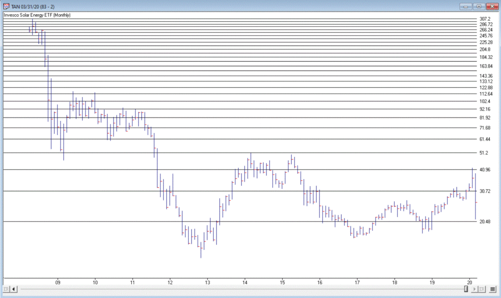
Figure 1 – Ticker TAN (Courtesy AIQ TradingExpert)

Ticker UGA

In a sure “Sign of the Times”, the Good News is that gasoline prices are at their lowest levels in year, while the Bad News is that we don’t have anywhere to drive to except the grocery store.  Figure 2 displays the chart for ticker UGA – the United States Gasoline Fund, and ETF that tracks the price of gasoline.

While attempting to “pick a bottom” is a fool’s errand, the primary point is that it is not that hard to envision the price of this ETF being significantly higher at some point in the years ahead.  Whether an investor has the fortitude to weather whatever the short-term uncertainty and the patience to see how the long-term plays out are the primary issues associated with contemplating this ticker at the moment.

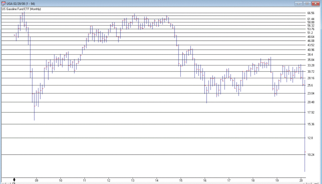
Figure 2 – Ticker UGA (Courtesy AIQ TradingExpert)

Ticker XLE

Ticker XLE is a play on the broad (mostly fossil fuel related) energy sector.  As you can see in Figure 3, XLE has plunged to price levels not since 2004. In addition, it presently yields roughly 8.8%.  That being said, an investor has to realistically expect that dividend payments in the hard-hit energy sector will see some significant cuts as things play out in the months ahead. 

With an oil price war in full swing, not to mention a sharp decline in demand for the foreseeable future due to the coronavirus pandemic, the fundamentals for this sector are unlikely to improve soon.  Nevertheless, the reality is that – at least for the time being – the world runs on crude oil.  As a result, the current price range may one day be looked back upon as a once-in-a-generation buying opportunity.

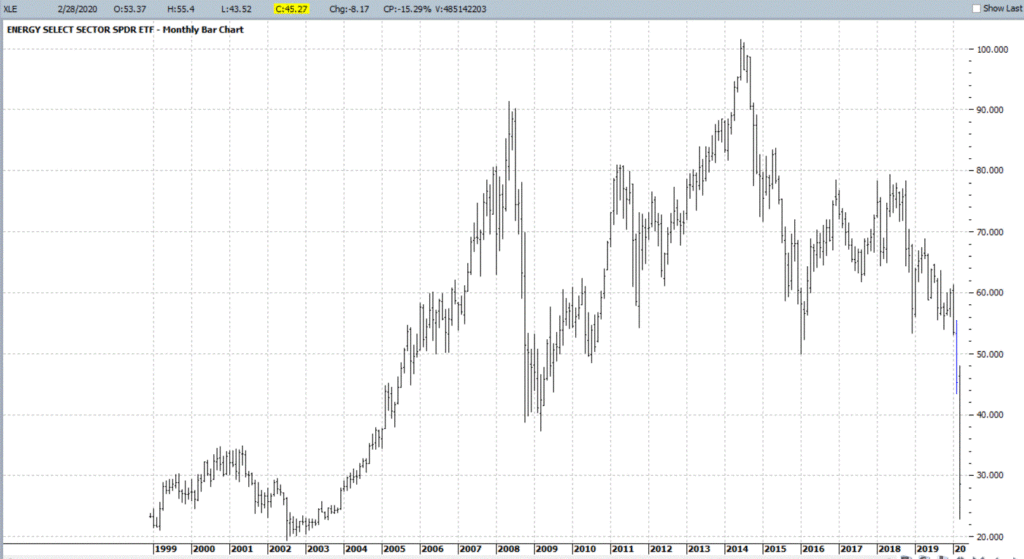
Figure 3 – XLE (Courtesy ProfitSource by HUBB)

Ticker PAGP

OK, let’s throw in one obscure, totally speculative – yet fundamentally intriguing – thought for consideration.  Ticker PAGP (Plains GP Holdings, L.P.).  Here is what they do (straight from their website):

“Plains engages in the transportation, storage, terminalling, and marketing of crude oil and refined products, as well as in the storage of natural gas, and the processing, transportation, fractionation, storage, and marketing of natural gas liquids.

Assets include:

*17,965 miles of active crude oil and NGL pipelines and gathering systems (emphasis mine as these things will continue to function as long as crude and NG need to be moved – which they do)

*50 barges and 20 transport tugs

*109 million barrels of storage capacity

*1,600+ trucks and trailers

*9,100 rail cars”

The bottom line is that as long as crude oil and natural gas needs to be moved, PAGP has a niche in which to operate.  For the record, at $6.35 a share the stock’s present dividend comes to a yield of 22.7%.  Certainly, the prospect of a significant dividend cut is a Signiant risk associated with this stock.  But for the moment anyway the price is near an all-time low and the dividend yield is attractive.

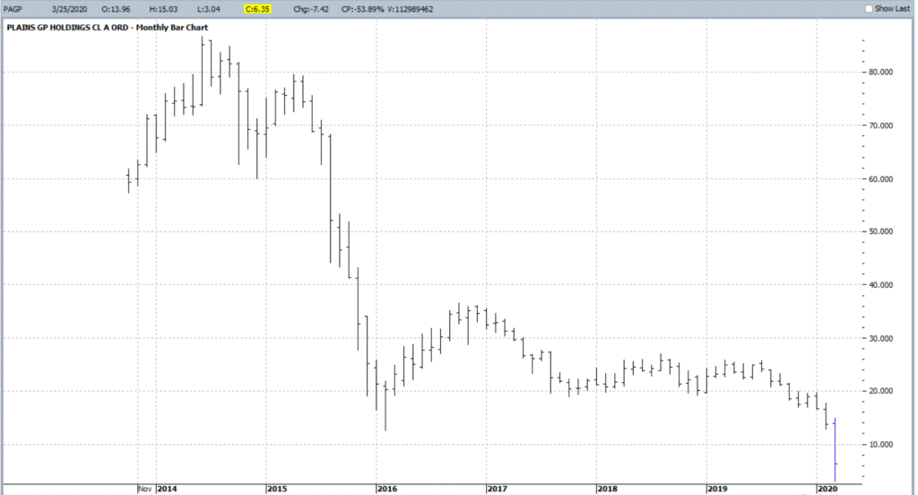
Figure 4 – Ticker PAGP (Courtesy ProfitSource by HUBB)

Summary

As allows, DO NOT look upon what I have written as “recommendations.”  Particularly in the current environment.  They are simply “food for thought.”

Given current fundamentals:

*An ongoing oil price war (making drilling and refining unprofitable for many companies)

*An economy on shutdown (which cripples demand)

*An existential struggle between “green” energy and “traditional” fossil fuel-based sources (which creates uncertainty about future expectations)

All combine to make the energy sector a giant question mark at the present time.  But if the old adage that the time to buy is when there is “blood in the streets”, than investors might be well served in the long run to start thinking now about how much capital they might be willing to commit to energy, and what type of catalyst might prompt them to actually “take the plunge.”

Jay Kaeppel

Disclaimer: The information, opinions and ideas expressed herein are for informational and educational purposes only and are based on research conducted and presented solely by the author.  The information presented does not represent the views of the author only and does not constitute a complete description of any investment service.  In addition, nothing presented herein should be construed as investment advice, as an advertisement or offering of investment advisory services, or as an offer to sell or a solicitation to buy any security.  The data presented herein were obtained from various third-party sources.  While the data is believed to be reliable, no representation is made as to, and no responsibility, warranty or liability is accepted for the accuracy or completeness of such information.  International investments are subject to additional risks such as currency fluctuations, political instability and the potential for illiquid markets.  Past performance is no guarantee of future results.  There is risk of loss in all trading.  Back tested performance does not represent actual performance and should not be interpreted as an indication of such performance.  Also, back tested performance results have certain inherent limitations and differs from actual performance because it is achieved with the benefit of hindsight.

How Do You Handle a Problem Like October?

OK, so this particular piece clearly does NOT qualify as “timely”.  Hey, they can’t all be “time critical, table-pounding, you must act now” missives.  In any event, as part of a larger project regarding trends and seasonality in the market, I figured something out – we “quantitative analyst types” refer to this as “progress.”

So here goes.

The Month of October in the Stock Market

The month of October in the stock market is something of a paradox.  Many investors refer to it as “Crash Month” – which is understandable given the action in 1929, 1978, 1979, 1987, 1997, 2008 and 2018.  Yet others refer to it as the “Bear Killer” month since a number of bear market declines have bottomed out and/r reversed during October.  Further complicating matters is that October has showed:

*A gain 61% of the time

*An average monthly gain of +0.95%

*A median monthly gain of +1.18%

Figure 1 displays the monthly price return for the S&P 500 Index during every October starting in 1945.

Figure 1 – S&P 500 Index October Monthly % +(-)

Figure 2 displays the cumulative % price gain achieved by holding the S&P 500 Index ONLY during the month of October every year starting in 1945.

Figure 2 – S&P 500 Index Cumulative October % +(-)

So, you see the paradox.  To simply sit out the market every October means giving up a fair amount of return over time (not to mention the logistical and tax implications of “selling everything” on Sep 30 and buying back in on Oct 31).  At the same time, October can be a helluva scary place to be from time to time. 

One Possible Solution – The Decennial Pattern

In my book “Seasonal Stock Market Trends” I have a section that talks about the action of the stock market across the average decade. The first year (ex., 2010) is Year “0”, the second year (ex., 2011) is Year “1”, etc.

In a nutshell, there tends to be:

The Early Lull: Often there is weakness starting in Year “0” into mid Year “2”

The Mid-Decade Rally: Particularly strong during late Year “4” into early Year “6”

The 7-8-9 Decline: Often there is a significant pullback somewhere in the during Years “7” or “8” or “9”

The Late Rally: Decades often end with great strength

Figures 3 and 4 display this pattern over the past two decades.

Figure 3 – Decennial Pattern: 2010-2019

Figure 4 – Decennial Pattern: 2000-2009

Focusing on October 

So now let’s look at October performance based on the Year of the Decade.  The results appear in Figure 5.  To be clear, Year 0 cumulates the October % +(-) for the S&P 500 Index during 1950, 1960, 1970, etc.  Year 9 cumulates the October % +(-) for the S&P 500 index during 1949, 1959, 1969, 1979, etc.

Figure 5 – October S&P 500 Index cumulative % +(-) by Year of Decade

What we see is that – apparently – much of the “7-8-9 Decline” takes place in October, as Years “7” and “8” of the decade are the only ones that show a net loss for October.

Let’s highlight this another way.  Figure 6 displays the cumulative % return for the S&P 500 Index during October during all years EXCEPT those ending “7” or “8” versus the cumulative % return for the S&P 500 Index during October during ONLY years ending in “7” or “8”.

Figure 6 – S&P 500 cumulative October % +(-); Years 7 and 8 of decade versus All Other Years of Decade

For the record:

*October during Years “7” and “8” lost -39%

*October during all other Years gained +196%

Summary

So, does this mean that October is now “green-lighted” as bullish until 2027?  Not necessarily.  As always, that pesky “past performance is no guarantee of future results” phrase looms large. 

But for an investor looking to maximize long-term profits while also attempting to avoid potential pain along the way, the October 7-8 pattern is something to file away for future reference.

Jay Kaeppel

Disclaimer: The information, opinions and ideas expressed herein are for informational and educational purposes only and are based on research conducted and presented solely by the author.  The information presented does not represent the views of the author only and does not constitute a complete description of any investment service.  In addition, nothing presented herein should be construed as investment advice, as an advertisement or offering of investment advisory services, or as an offer to sell or a solicitation to buy any security.  The data presented herein were obtained from various third-party sources.  While the data is believed to be reliable, no representation is made as to, and no responsibility, warranty or liability is accepted for the accuracy or completeness of such information.  International investments are subject to additional risks such as currency fluctuations, political instability and the potential for illiquid markets.  Past performance is no guarantee of future results.  There is risk of loss in all trading.  Back tested performance does not represent actual performance and should not be interpreted as an indication of such performance.  Also, back tested performance results have certain inherent limitations and differs from actual performance because it is achieved with the benefit of hindsight.

Where We Are (and One Thing to Watch For)

I haven’t written a lot lately.  Mostly I guess because there doesn’t seem to be a lot new to say.  As you can see in Figure 1, the major market indexes are in an uptrend.  All 4 (Dow, S&P 500, Russell 2000 and Nasdaq 100) are above their respective 200-day MA’s and all but Russell 2000 have made new all-time highs.

Figure 1 – 4 Major Market Indexes (Courtesy AIQ TradingExpert)

As you can see in Figure 2, my market “bellwethers” are still slightly mixed.  Semiconductors are above their 200-day MA and have broken out to a new high, Transports and the Value Line Index (a broad measure of the stock market) are holding above their 200-day MA’s but are well off all-time highs, and the inverse VIX ETF ticker ZIV is in a downtrend (ideally it should trend higher with the overall stock market).

Figure 2 – Jay’s 4 Market “Bellwethers” (Courtesy AIQ TradingExpert)

As you can see in Figure 3, Gold, Bonds and the U.S. Dollar are still holding in uptrends above their respective 200-day MA’s (although all have backed off of recent highs) and crude oil is sort of “nowhere”.

Figure 3 – Gold, Bonds, U.S. Dollar and Crude Oil (Courtesy AIQ TradingExpert)

Like I said, nothing has really changed.  So, at this point the real battle is that age-old conundrum of “Patience versus Complacency”.  When the overall trend is clearly “Up” typically the best thing to do is essentially “nothing” (assuming you are already invested in the market).  At the same time, the danger of extrapolating the current “good times” ad infinitum into the future always lurks nearby. 

What we don’t want to see is:

*The major market averages breaking back down below their 200-day MA’s.

What we would like to see is:

*The Transports and the Value Line Index break out to new highs (this would be bullish confirmation rather the current potentially bearish divergence)

The Importance of New Highs in the Value Line Index

One development that would provide bullish confirmation for the stock market would be if the Value Line Geometric Index were to rally to a new 12-month high.  It tends to be a bullish sign when this index reaches a new 12-month high after not having done so for at least 12-months.

Figure 4 displays the cumulative growth for the index for all trading days within 18 months of the first 12-month new high after at least 12-months without one.

Figure 4 – Cumulative growth for Value Line Geometric Index within 18-months of a new 12-month high

Figure 5 displays the cumulative growth for the index for all other trading days.

Figure 5 – Cumulative growth for Value Line Geometric Index during all other trading days

In Figure 4 we see that a bullish development (the first 12-month new high in at least 12 months) is typically followed by more bullish developments. In Figure 5 we see that all other trading days essentially amount to nothing.

Figure 6 displays the Value Line Geometric Index with the relevant new highs highlighted.

Figure 6 – Value Line Geometric Index (Courtesy AIQ TradingExpert)

Summary

The trend at this very moment is “Up.”  So sit back, relax and enjoy the ride.  Just don’t ever forget that the ride WILL NOT last forever.  If the Value Line Geometric Index (and also the Russell 2000 and the Dow Transports) joins the party then history suggests the party will be extended.  If they don’t, the party may end sooner than expected.

So pay attention.

Jay Kaeppel

Disclaimer: The information, opinions and ideas expressed herein are for informational and educational purposes only and are based on research conducted and presented solely by the author.  The information presented does not represent the views of the author only and does not constitute a complete description of any investment service.  In addition, nothing presented herein should be construed as investment advice, as an advertisement or offering of investment advisory services, or as an offer to sell or a solicitation to buy any security.  The data presented herein were obtained from various third-party sources.  While the data is believed to be reliable, no representation is made as to, and no responsibility, warranty or liability is accepted for the accuracy or completeness of such information.  International investments are subject to additional risks such as currency fluctuations, political instability and the potential for illiquid markets.  Past performance is no guarantee of future results.  There is risk of loss in all trading.  Back tested performance does not represent actual performance and should not be interpreted as an indication of such performance.  Also, back tested performance results have certain inherent limitations and differs from actual performance because it is achieved with the benefit of hindsight.

Keep a Close Eye on the U.S. Dollar

As the primary currency recognized around the globe, the U.S. Dollar is pretty important.  And the trend of the dollar is pretty important also.  While a strong dollar is good in terms of attracting capital to U.S. shores, it makes it more difficult for U.S. firms that export goods.  One might argue that a “steady” dollar is generally preferable to a very strong or very weak dollar.

Speaking of the trend of the dollar, a lot of things move inversely to the dollar.  In fact, one can typically argue that as long as the dollar is strong, certain “assets” will struggle to make major advances.  These include – commodities in general, metals specifically, foreign currencies (obviously) and international bonds (strongly). 

Let’s first take a look at the state of the dollar.

Ticker UUP

For our purposes we will use the ETF ticker UUP ( Invesco DB US Dollar Index Bullish Fund) to track the U.S. Dollar.  Figure 1 displays a monthly chart and suggests that UUP just ran into – and reversed at least for now – in a significant zone of resistance.

Figure 1 – UUP Monthly (Courtesy ProfitSource by HUBB)

Figure 2 displays a weekly chart which suggests the possibility that UUP has completed a 5-wave advance.

Figure 2 – UUP Weekly (Courtesy ProfitSource by HUBB)

Figure 3 displays a daily chart and paints a more potentially bullish picture, looking for a 5th Wave up.

Figure 3 – UUP Daily (Courtesy ProfitSource by HUBB)

Which way will things go?  It beats me.  But I for one will be keeping a close eye on UUP versus the resistance levels highlighted in Figures 1 and 2.  So will traders of numerous other securities.

Inverse to the Buck

Figure 4 displays the 4-year weekly correlation for 5 ETFs to ticker UUP (a correlation of 1000 means they trade exactly the same a UUP and a correlation of -1000 means they trade exactly inversely to UUP).

Figure 4 – 4-Year Correlation to ticker UUP (Courtesy AIQ TradingExpert)

In the following charts, note the inverse relationship between the dollar (UUP on the bottom) and the security in the top chart. When the dollar goes way down they tend to go way up – and vice versa.

Note also that in the last year several of these securities went up at the same time the dollar did. This is a historical anomaly and should not be expected to continue indefinitely.

Figure 5 – Ticker DBC (Invesco DB Commodity Index Tracking Fund) vs. UUP (Courtesy  AIQ TradingExpert )

Figure 6 – Ticker SLV (iShares Silver Trust) vs. UUP (Courtesy  AIQ TradingExpert )

Figure 7 – Ticker GLD (SPDR Gold Shares) vs. UUP (Courtesy 
AIQ TradingExpert )

Figure 8 – Ticker BWX (SPDR Bloomberg Barclays International Treasury Bond) vs. UUP (Courtesy  AIQ TradingExpert )

Figure 9 – Ticker IBND (SPDR Bloomberg Barclays International Corporate Bond) vs. UUP (Courtesy  AIQ TradingExpert )

Figure 10 – Ticker FXE (Invesco CurrencyShares Euro Currency Trust) vs UUP (Courtesy  AIQ TradingExpert )

Summary

If the dollar fails to break out of it’s recent resistance area and actually begins to decline then commodities, currencies, metals and international stocks and bonds will gain a favorable headwind. How it all actually plays out, however, remains to be seen.

So keep an eye on the buck. Alot is riding on it – whichever way it goes.

Jay Kaeppel

Disclaimer:  The data presented herein were obtained from various third-party sources.  While I believe the data to be reliable, no representation is made as to, and no responsibility, warranty or liability is accepted for the accuracy or completeness of such information.  The information, opinions and ideas expressed herein are for informational and educational purposes only and do not constitute and should not be construed as investment advice, an advertisement or offering of investment advisory services, or an offer to sell or a solicitation to buy any security.

Yes, the Stock Market is at a Critical Juncture (and What to Do About It)

As usual, you can pretty much see whatever you want to see in today’s stock market.  Consider the major indexes in Figure 1, displayed along with their respective 200-day moving averages.

Figure 1 – Major Indexes (Courtesy AIQ TradingExpert)

If you “want to” be bullish, you can focus on the fact that all 4 of these major indexes are presently above their respective 200-day moving averages.  This essentially defines an “uptrend”; hence you can make a bullish argument.

If you want to be “bearish”, you can focus on the “choppy” nature of the market’s performance and the fact that very little headway has been made since the highs in early 2018.  This “looks like” a classic “topping pattern” (i.e., a lot of “churning”), hence you can make a bearish argument.

To add more intrigue, consider the 4 “market bellwethers” displayed in Figure 2.

Figure 2 – Jay’s Market Bellwethers (Courtesy AIQ TradingExpert)

(NOTE: Previously I had Sotheby’s Holdings – ticker BID – as one my bellwethers.  As they are being bought out, I have replaced it with the Value Line Arithmetic Index, which has a history of topping and bottoming prior to the major indexes)

The action here is much more mixed and muddled.

*SMH – for any “early warning” sign keep a close eye on the semiconductors.  If they breakout to a new high they could lead the overall market higher. If they breakdown from a double top the market will likely be spooked.

*TRAN – The Dow Transports topped out over a year ago and have been flopping around aimlessly in a narrowing range.  Not exactly a bullish sign, but deemed OK as long as price holds above the 200-day moving average.

*ZIV – Inverse VIX is presently below it’s 200-day moving average, so this one qualifies as “bearish” at the moment.

*VAL-I – The Value Line Index is comprised of 1,675 stocks and gives each stock equal weight, so is a good measure of the “overall” market.  It presently sits right at its 200-day moving average, however – as you can see in Figure 3 – it is presently telling a different story than the S&P 500 Index.

Figure 3 – S&P 500 trending slightly higher, Value Line unweighted index trending lower (Courtesy AIQ TradingExpert)

The Bottom Line

OK, now here is where a skilled market analyst would launch into an argument regarding which side will actually “win”, accompanied by roughly 5 to 50 “compelling charts” that “clearly show” why the analysts’ said opinion was sure to work out correctly.  Alas, there is no one here like that. 

If the question is, “will the stock market break out to the upside and run to sharply higher new highs or will it break down without breaking out to new highs?”, I sadly must default to my standard answer of, “It beats me.”

Here is what I can tell you though.  Instead of relying on “somebody’s opinion or prediction” a much better bet is to formulate and follow an investment plan that spells out:

*What you will (and will not) invest in?

*How much capital you will allocate to each position?

*How much risk you are willing to take with each position?

*What will cause you to exit with a profit?

*What will cause you to exit with a loss?

*Will you have some overarching “trigger” to cause you to reduce overall exposure?

*And so on and so forth

If you have specific answers for the questions above (you DO have specific answers, don’t you?) then the correct thing to do is to go ahead and follow your plan and ignore the myriad prognostications that attempt to sway you one way or the other.

Jay Kaeppel

Disclaimer:  The data presented herein were obtained from various third-party sources.  While I believe the data to be reliable, no representation is made as to, and no responsibility, warranty or liability is accepted for the accuracy or completeness of such information.  The information, opinions and ideas expressed herein are for informational and educational purposes only and do not constitute and should not be construed as investment advice, an advertisement or offering of investment advisory services, or an offer to sell or a solicitation to buy any security.